

Human centered computing and crisis informatics provide a window into how humans and our systems perform in a crisis. Melissa Bica has devised a tool to visualize and analyze our social media activity during these crucial moments.
- SC15 highlights rising talent and cutting edge technology.
- University of Colorado Boulder student Melissa Bica devises social media analytics tool.
- RendezView will help improve performance in crises.

Rising star. Melissa Bica, PhD student at University of Colorado Boulder (UCB), has developed RendezView, a social media mining tool to help manage response to disasters.
One of the best aspects of visiting the International Conference for High-Performance Computing, Networking, Storage and Analysis (SC15) in Austin, TX was the chance to see the future of computationally enabled science and to meet the rising stars of the high-performance computing world. One of these up-and-coming talents is Melissa Bica, PhD student at University of Colorado Boulder (UCB). Bica’s focus on human-centered computing (HCC) has resulted in RendezView, a data mining tool that is poised to revolutionize crisis informatics.
Crisis informatics and HCC provide a window into how the public uses information during a disaster. Hurricanes, earthquakes, terrorist attacks, and the like generate a large amount of social media traffic, and reveal how humans and human systems perform during a crisis.
For instance, during the recent terror attacks in Paris, habitants of the city took to Twitter with the hashtag #porteouvert as a way of offering shelter to people stranded on the streets amidst the chaos. Vulnerable visitors with nowhere to go could find temporary shelter by searching for this hashtag on Twitter and locating refuge nearby. Focusing specifically on social media ‘flock’ phenomena (clusters of similar data), such as that created with #porteouvert on Twitter, HCC researchers can analyze data sets with RendezView, an online interface that displays social media data in easily understandable visualizations.
“We can see where these events are occurring and who they’re affecting, how people want to help from different geographic regions, and which regions need resources,” says Bica, member of the RendezView research team. “It gives you a much better picture of what’s going on during an event.”
“Technology is meant to help the world.”~ Melissa Bica.
While in Japan last summer, Bica and her team developed RendezView through a collaboration between the US National Science Foundation (NSF), Open Science Data Cloud (OSDC), Partnerships for International Research and Education (PIRE), and the National Institute of Advanced Industrial Science and Technology (AIST). Currently in the prototype phase, RendezView will allow scientists to upload their data into the system, and then convert the data into 3D time and space maps, tag clouds to show the importance of certain words, or a Sankey diagram that uses arrow width to illustrate the quantity of ideas flowing. These tools make it easy to analyze flock patterns and relationships in complex data.
The current version of RendezView represents local topics and their co-occurrence relationships from geo-tagged Twitter messages. Using RendezView, researchers and scientists can investigate social phenomena over a geographic region, such as patterns in work and hiring, or trends in political discourse.
“Technology is really meant to help people and the world in general,” says Bica. “Ultimately, this is what we want to achieve with HCC research. There has to be something that connects technology to people and makes it accessible. That’s what RendezView is for.”
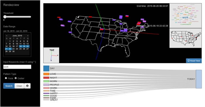
RendezView. This screenshot shows the user interface layout, design, and functionalities of the RendezView framework. Each cube’s position, dimensions, and color correspond to geospatial, temporal, and/or topic metadata. Additional visualizations include a word cloud, a 2D map to more clearly show geospatial dimensions, and labels displaying the time range of the selected data. The user can click on links between keywords to display geospatial temporal intersections of those keywords on the 3D map. Courtesy Melissa Bica.
In RendezView, filtered data is first visualized in a 3D map. The user selects boxes in the map and a word cloud appears, displaying data from the user-selected spatiotemporal area. The word cloud shows the relative frequency of words, indicating which words to use to filter in subsequent searches. This also determines which keyword links the user should select from the Sankey diagram in order to display the most common keyword co-occurrences on the 3D map. These interactions allow the user to conduct a thorough analysis and find patterns hidden deep within the data.
“The point of having this type of framework is to better understand the people and their needs through visualization,” Bica explains. In the context of crisis informatics research and as shown with the #porteouvert trend, for example, the RendezView framework is an ideal tool to analyze collected data.”
Future work includes connecting the interface to a live database, enhancing interaction between the various visuals, and improving user interaction and depth of visualization. “Right now the prototype is designed to be a historical archive of what has happened,” Bica notes. “It can be used as a teaching tool to show us where resources need to go to better prepare us for disasters. The ultimate goal is real-time visual data mining.”
One challenge faced by the team, and by computer science in general, is to interpret sentiments of tweets, rather than merely processing words or characters. For instance, irony and humor are often lost in automated algorithms, so the team at AIST has to manually process millions of tweets to test the prototype and make improvements. Considering the data sets her team has been handling range from 2 to 22 million, this could take some time.
Bica and her team are up to the task, you can be sure. We’ll check back to see how RendezView progresses.
This article was originally published on ScienceNode.org, written by Sam Stalion. Read the original article.


