

Moritz Stefaner wants to visually “guide the users to the data” in the dataviz-driven OECD Data Portal
The Organisation for Economic Co-operation and Development (OECD), now more than 50 years old, has just opened a new beta Data Portal to share their large sets of data to the public, with a highly responsive interface and nearly 600 readily clickable databases filterable by topics including:


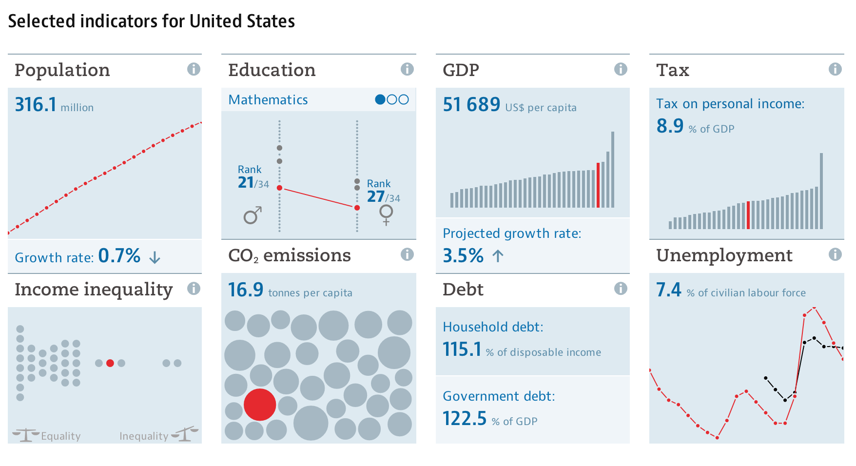
OECD’s new Data Portal Beta view of Selected Indicators for the United States
Agriculture
- Development
- Economy
- Education
- Energy
- Environment
- Finance
- Government
- Health
- Innovation and Technology
- Jobs
- Society
Moritz Stefaner, who describes himself as a “Truth and Beauty Operator”, reports on his blog, well-formed-data.net, that he is responsible for the chart designs, specifications, and general data visualization strategy. He also says, “the main design credit goes to Raureif, and the UI implementation has been done by 9elements.”
“Unlike many of my other projects, this project is less about spotting patterns in the data, or communicating insights, but starts one step earlier: How can we actually make large collections of data sets available, and how can we guide users to the datasets they are looking for?”
He also gives a video demonstration of the concept prototyping for the charts for the site:
[vimeo url=”http://vimeo.com/99833532″ fs=”0″ portrait=”0″]
One of the strongest features in the Portal is the ability both to interact immediately with the data and a request for feedback on the usability of the Data Portal itself. This is an unusually direct approach to gather user experience/usability information on a website, and should give the design/development team the ability to really keep up the site’s development in an Agile way. Perhaps it will stay in perpetual Beta, as Google did with Gmail for years!
Here’s an embedded index I have created, starting from one of their defaults charts, THE BETTER LIFE INDEX. Using a combination of factors (education, housing, work-life balance, etc), and Stefaner cleverly assigned petals to each indicator, with the length of the petal representing the quantitative value for that indicator, and the sum of the indicators reflected in the height of the stem. In this view, I have the chart listing countries by rank:
I would suggest both reading Moritz Stefaner’s post and visiting the OECD’s Data Portal, to learn how to create a responsive environment that puts the user’s need to get to information first, while taking advantage of everything (short of video) a web browser can do without requiring massive bandwidth.
What do you think of the interface? What about the Tufte and Stephen Few-approved color palettes, and particular features of the design? Please share your comments below.


[…] OECD’s Data Portal, full of interactive dataviz, now in public betaVizWorld.com | VizWorld.com. […]
[…] Moritz Stefaner wants to visually "guide the users to the data" in the dataviz-driven OECD Data Portal The Organisation for Economic Co-operation and Development (OECD), now more than 50 years old, has just opened a new beta Data Portal to share their large sets of data to the public, with a highly responsive interface and nearly 600 readily clickable databases filterable by topics including: OECD's new Data Portal Beta view of Selected Indicators for the United States Agriculture Development Economy Education Energy Environment Finance Government Health Innovation and Technology Jobs Society Moritz Stefaner, who describes himself as a "Truth and Beauty Operator", reports on his blog, well-formed-data.net, that he is responsible for the chart designs, specifications, and general data visualization strategy. He also says, "the main design credit goes to Raureif, and the UI implementation has been done by 9elements." "Unlike many of my other projects, this project is less about […]
[…] Projektowanie / Rozwój umiejętności naprawdę nadążyć rozwoju witryny w … Przeczytaj VizWorld.com Monmouth County Home projektu Usługi budowlane wprowadza Informacje … Matawan, NJ, 03 […]