

[youtube url=”http://www.youtube.com/watch?v=j2Hilf6bz0I” fs=”1″ hd=”1″ rel=”0″ showsearch=”0″]
Open Data has come to represent a goal, as important as cloud computing, and perhaps the symbolic representation of “freedom of speech” for data scientists across many disciplines.
On January 24, 2014, the Center for Data Innovation hosted Data Innovation Day 2014, with a variety of talks and panels that invariably focused not only on innovative applications of data (big or not), but with the subtext of open data threaded throughout nearly every talk.
To highlight aspects of the use of open data in data visualization, for this video interview I spoke with three participants in the conference, one a panelist and two exhibitors.
Can open data be monetized?
The first interview on video is with Joel Gurin (@joelgurin), author of Open Data Now: The Secret to Hot Startups, Smart Investing, Savvy Marketing, and Fast Innovation![]() , Senior Advisor to NYU’s Governance Lab, and director of opendata500.com.
, Senior Advisor to NYU’s Governance Lab, and director of opendata500.com.
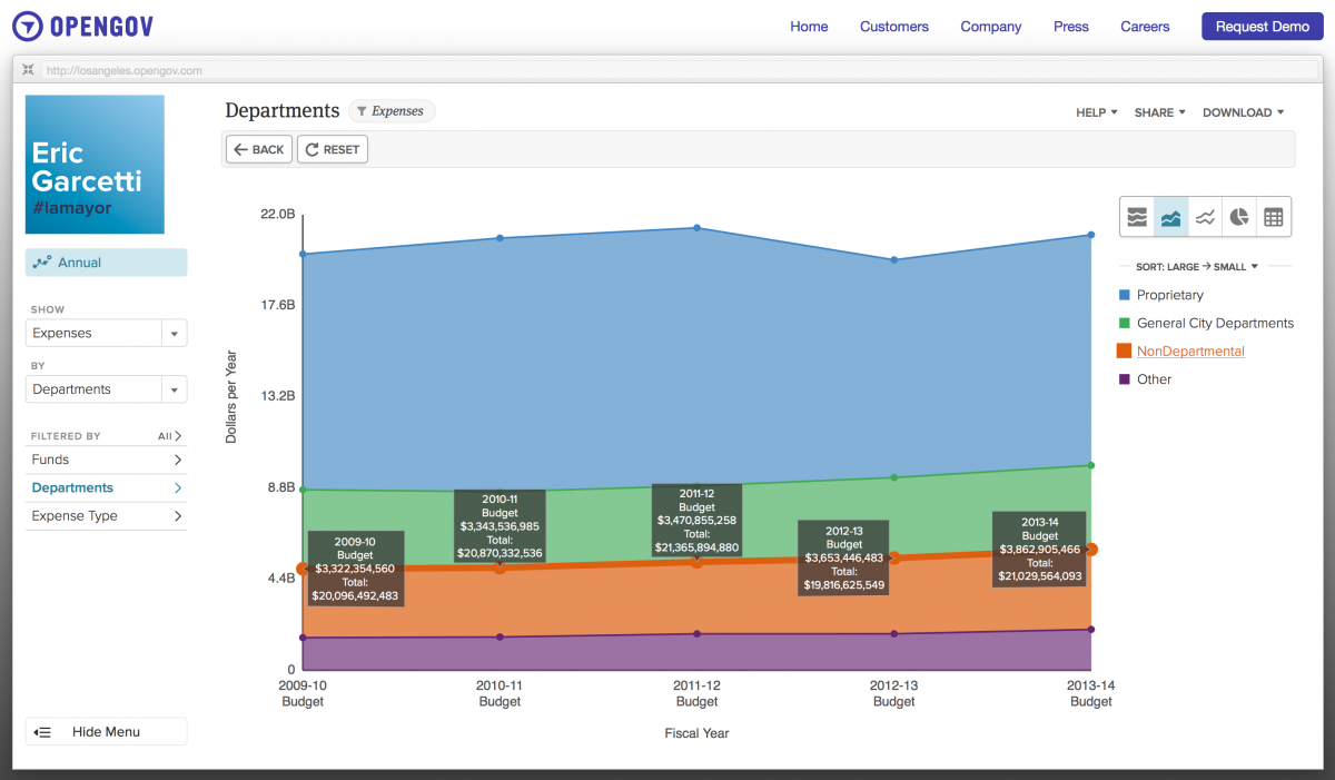
screen shot of opengov.com graphic applying open data from municipal government source
I asked specifically where Joel saw open data being used to monetize data visualization as a business offering. He sees this as a new prospect for businesses, and mentioned first that getting the data out there conveniently, such as enigma.io is trying to offer is a first step. Opengov.com has taken a next step, by offering data visualized from government sources, starting simply with a few United States municipalities, and cleanly-presented graphics.
He also noted that open data is being used by businesses to improve their business intelligence, citing companies within the moving business combining openly available trade and demographic data with their internal data to look for patterns in moving across cities and areas of the country, which can better inform strategic planning.
Hacking Open Data to Create Data Visualizations for Social Good
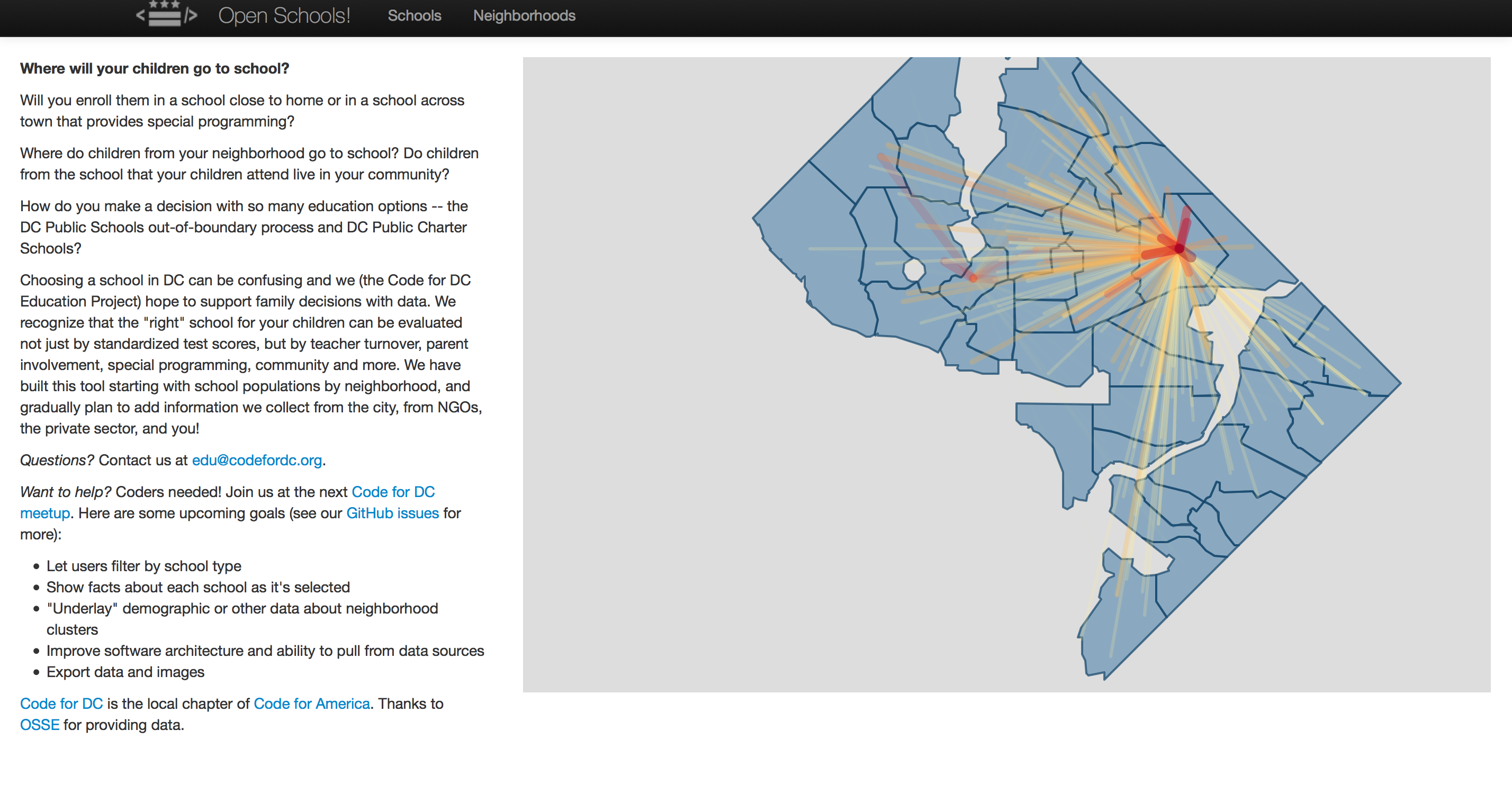
Data visualization from Code for DC’s Open School project
The next interview is with Matt Bailey (@mattbailey0), Brigade Captain of Code for DC, a local chapter of Code for America. The Code for DC meetup is run by and for volunteers, with meetings every few weeks. The group holds hackathons where civic hackers, data scientists, data visualization creators, user experience designers/developers, journalists and activists work on projects to address social and political problems in the city through the lens of technology, using a variety of techniques and tools.
The project on display is called “Open schools”, and is live at edu.codefordc.org, and addresses the question of “where to send my kids to school?” that parents face. Specifically, the visualization identifies where students live as opposed to where they attend school, which helps parents visualize the issues of travel and community when facing whether to have their children go to a local school or, perhaps, a charter school located outside of their immediate neighborhood.
Matt points out some interesting conclusions about which neighborhoods feed which schools, and it’s not always the case that all students come from local neighborhoods.
Mapping Data: the CartoDB platform plugs in and maps your data through widgets
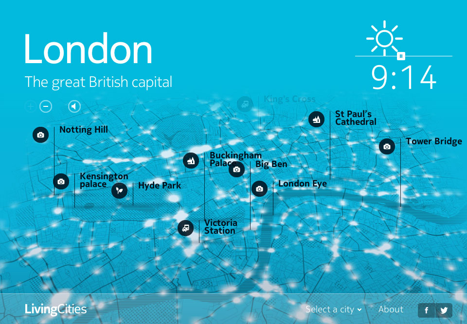
A mapped interactive data visualization running on CartoDB
We have become accustomed to seeing data placed on maps, both local and global. CartoDB brings the power of mapping data visualizations through a web-based widgetized offering (using a tiered paid model), that give you the ability to create live maps and then embed or reuse them elsewhere. The offering also allows for interactivity, specified as you choose, to create a deeper experience.
Andrew Hill (@andrewxhill) spoke with me the features and benefits of CartoDB. For Open Data users, the good news is that CartoDB can ingest and display data in a wide variety of formats, and can manage large-scale data sets readily. It is, of course, up to the user to decide how much cleaning is necessary for good results, but the widgetized system allows the map creator to experiment quickly, with a massive set of maps already to overlay data. SQL users can dig in and work their magic, but those unfamiliar with SQL’s structure can depend on building right out of the box, through a logical interface
There will be additional interviews and content posted from Data Innovation Day 2014: please pardon the evening scene from a fine warm day in Washington DC in the video’s background: The actual day was bright but chilly, with Washington DC’s streets full of snow, making it impossible to set up a fine intro outside of the building where the conference took place.


[…] Open Data has its day: Data Innovation Day 2014 Interviews (Part 1) […]