

[vimeo url=”http://vimeo.com/72048069″ title=”0″ fs=”0″ portrait=”0″] CartoDB, which offers statistical/visualization mapping through their web-based system, has announced new updates today and will be launching the updated service at O’Reilly’s Strata Conference in London. The website for their online service is http://www.cartodb.com
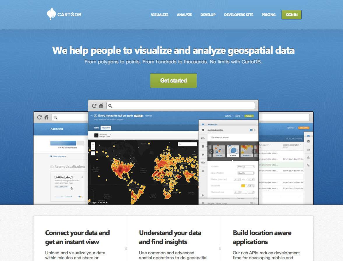 For the past year and a half, CartoDB has been allowing its users to visualize data, publish maps, and create interactive visualizations on the web. Now, the map service is creating a whole new field of online mapping with animated geo-temporal maps built with a simple interface, which they say makes this type of mapping available “with the click of a button”, and requires no coding knowledge.
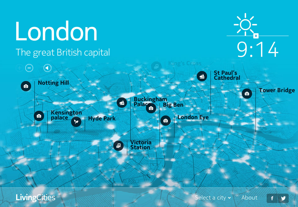
Early versions of the CartoDB technology have been used by scientists to monitor deforestation (http://blog.cartodb.com/post/53127600321/big-data-deforestation-visualization), by business to help visualize traffic patterns (http://here.com/livingcities), and by Twitter to share tweets during the NBA finals (https://blog.twitter.com/2013/the-nba-finals-visualized) and during the Wimbledon tennis tournament (https://blog.twitter.com/2013/twitter-at-wimbledon-downright-smashing).
 The new animated map technology combined with legends, synced tables, and easy integration with other services such as Google Drive and Dropbox. Their goal is to help people move away from complex and expensive desktop tools and into an intuitive web-based application, reducing the steep learning curve that has historically stood in the way of putting geospatial data on the web.
 As an example of the new update made this past week,the video below show one user-friendly additions, described as “a huge improvement of the Category maps, they now support image markers for your categories. Now you can use images you upload to CartoDB for each of category you want on your map; you don’t need to code CartoCSS anymore.” [CartoCSS is their CSS-like, text-based method of using code to visually implement various elements, either built into CartoDB or brought in by the designer]
[vimeo url=”http://vimeo.com/78723007″ fs=”0″ portrait=”0″]
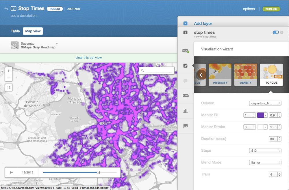
Also announced today is the animation visualizations for CartoDB called Torque. By using the the Torque visualizations you can animate your data directly on an interactive map. Just like your point maps and choropleths, now you can see how your data has grown, moved, or changed over time and space. Here is a video demonstrating how to use Torque to create a stylized animation of changes in data over time with Torque and CartoDB.
[vimeo url=”http://vimeo.com/79115503″ fs=”0″ portrait=”0″]
CartoDB is offered publicly through a freemium model, where the basic, starter level allows users to have up to 5 tables, 5MB of data, 10K of map views and 1,000 geocodings.
[signoff icon=”icon-tools”]CartoDB will be offering online training on December 3, check on this to sign up: http://blog.cartodb.com/post/66372286509/online-mapping-for-beginners-a-free-online-course[/signoff]


