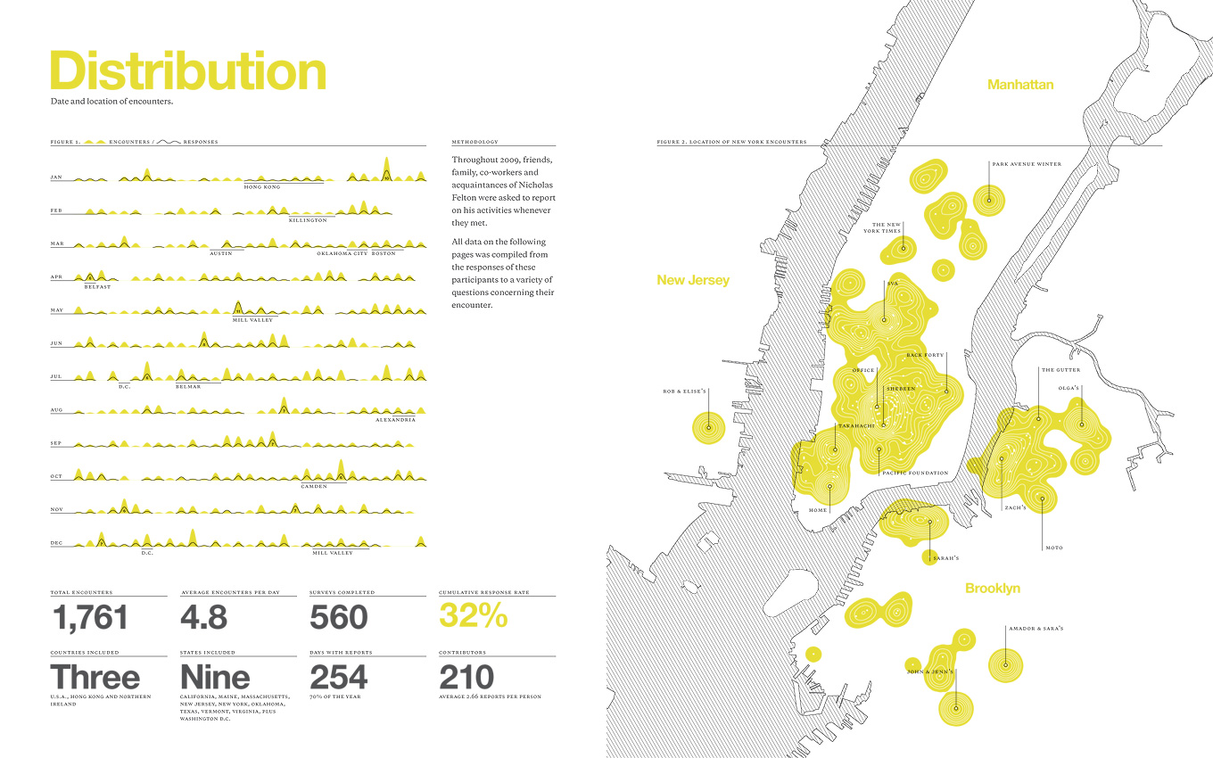
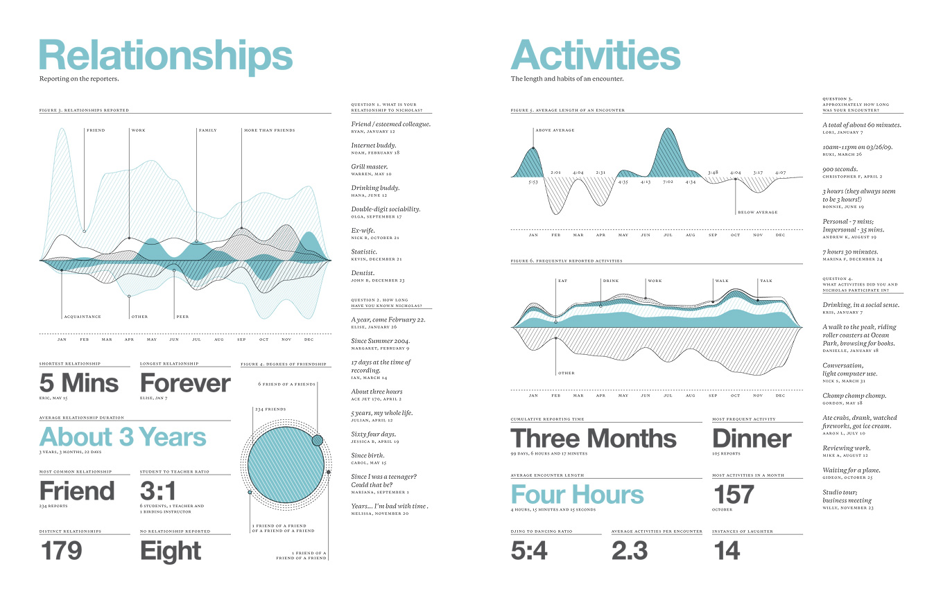
2009 has come to a close, and Nicholas Feltron has published another fantastic infographic report of how he spent the year. This year, he handed out individualized survey cards to everyone he met over the year, asking them to fill out a short survey about the experience. The result was a chaotic mess of a dataset that he turned into some beautiful graphics.
The data set itself was messy and overwhelming, and filled with enough information for several more reports. There are inherent shortcomings (like the unrepresentative amount of water recorded), and endearing strong suits (like the exploration of mood). I used several tools to make this task a more manageable, including Processing, which allowed me to map and explore alternate layouts much more quickly than previously, and Amazon's Mechanical Turk.
His site is, understandably, under a lot of strain right now. I’ve included the first two graphics in medium-resolution after the break, hit his site for the rest.
via Nicholas Felton | Feltron.com.